I've been experimenting some with Eclipse's emulated tabs on OS X ...
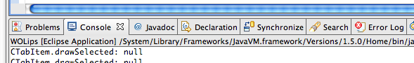
This is the tabs with an implementation of the Safari tab style:
The primary thing here is that in Safari, the tabs hang off of the
bottom of the toolbar area, which has a gradient that attaches that is
the hue of the selected tab (so the tabs "connect" to the toolbar).
In Eclipse, you have tabs in many areas, most of which do NOT hang off
of the toolbar. So in an ideal OS X-ish style, what should Eclipse
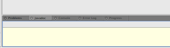
tabs look like? The current tabs:
look basically like Windows ... (Also, we'll probably swap the X and
icon. Right now I'm skipping the icon draw -- I'm not convinced they
even add anything, though).
I'm wondering if the area between views should be the darker Leopard
style, which might make the tabs look less out-of-place.
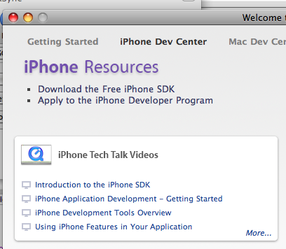
The Xcode getting started window shows a concept that might be
applicable for the views themselves:
with the gaussian blur shadow ... This is very limited, though, as it
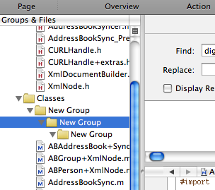
doesn't address draggable areas. Xcode's primary window has grab
handle split views:
The big question here is whether Eclipse would look silly if you
actually showed all the grab handles (which would be between every
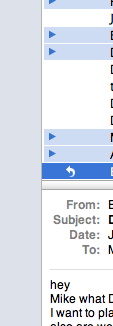
single view). It's technically TRUE, though. Mail app mixes thick
and thin style split panes:
where the vertical is a thin split pane (one pixel border) whereas the
horizontal is a thick with a grab handle.
So anyway, random things to think about ....... I'm open to any
suggestions here -- this is all just exploratory at the moment.
ms
This archive was generated by hypermail 2.0.0 : Wed Jun 18 2008 - 02:51:47 EDT