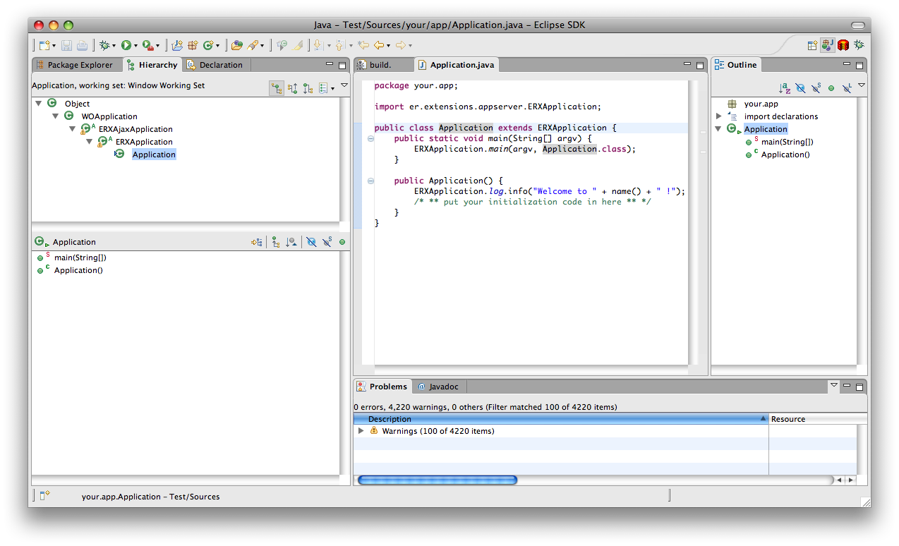
Still some rendering artifacts (view icons apparently render their own
background, which I need to look into, and the close icon in the
editor tab is still having its width calculated, which is why
"build.xml" is cutoff), but this is already looking better, I think.
Before:
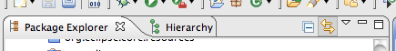
After:
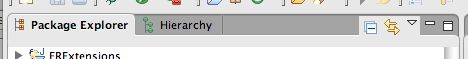
Aperture:
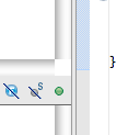
Incidentally, these drive me crazy, too:
Where the vertical and horizontal scrollbar meet, it's a white
square. Interestingly, it appears to be totally non-standard in OS X
as to how you deal with this.
ms
On Jun 19, 2008, at 2:55 PM, Mike Schrag wrote:
>> My personal preference is to have the aperture style but with the
>> icon on the left, and the icon becomes a close symbol when you
>> hover over it.
> I dig it, too ... I think we have a winner. I think I'll switch
> Eclipse views into that etched look also.
>
> ms
>
This archive was generated by hypermail 2.0.0 : Sun Jun 29 2008 - 12:25:05 EDT