I meant to add to the last email that I love the subtleness of the
splitviews.
On 30/06/2008, at 3:13 PM, Mike Schrag wrote:
>> When you click on the close button, the image doesn't switch to a
>> depressed mode like safari. The non active tabs have the depressed
>> button image.
> Yeah, I noticed that also -- Actually if you look closely, when you
> click it, it turns into the old red X from the old tab style.
It seems to be some sort of event tracking. If I click and hold down
but do not move, it stays the same, if I start to move or release
while over it it turns to the old red one.
>> Is it possible to override the default white background color...
> I really don't know how hard it is to do this one. I suspect if I
> do this, it will quickly reveal that lots of people don't inherit
> the background color properly and they'll be big white boxes on
> white. What color SHOULD that be?
I don't mind filing the bugs on other projects ;-). If we're using
Aperture for the design rules, then it would be the active tab color
(going by the meta data pane)
>
>
>> It would look nice in the Pro App color scheme If you're are
>> looking at using the aperture tabs.
> So I don't actually know how Apple changes the color scheme of the
> core components. I can't really change to the pro app backgrounds
> without also changing the widget sets or it will look really out of
> place.
I'm thinking just the data browser, text view, text field so there
less white on the gray.
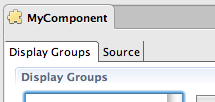
>> The tabs on the bottom edge look a bit out of place now, but
>> changing the background colour might fix that. The non-active tabs
>> are a different grey.
> Yeah ... This is the old tab style. I just haven't gotten to this
> one yet. I can't decide what it should look like. I think the
> depressed tab track might be a little bit much for these. I
> honestly don't like all these tabs all over the place, but I don't
> have much of a suggestion on an alternative.
Maybe this type of control. I don't think it is the greatest, but
probably better than having tabs on the bottom as well.
I thought I would install the latest nightly to see how it looked. I'm
not sure if this is a wolips thing that was broken in 3.4 or the look
and feel changes. I'm sure you're seeing this as well, but just incase.
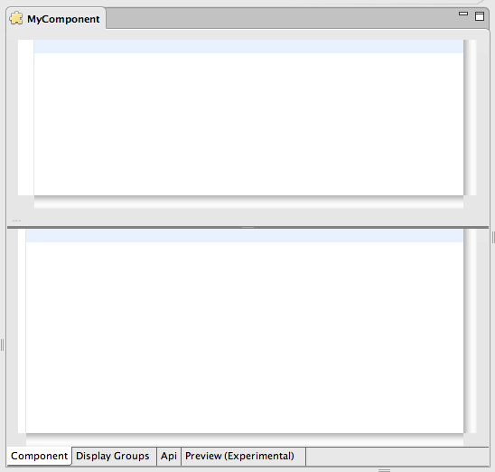
Left column/bottom left corner (both html and wod)
Split view
bottom right corner of the scroll views - they look like they are
floating
tabs
I would like to help out on this. How can I help you out?
Greg
This archive was generated by hypermail 2.0.0 : Mon Jun 30 2008 - 18:34:24 EDT